






































 Illuminated Letters 1
 Illuminated Letters 2
 Illuminated Letters 3
 Illuminated Letters 4
 Illuminated Letters 5
 Illuminated Letters 6
 Illuminated Letters 7
 Illuminated Letters 8



Illuminated Letters
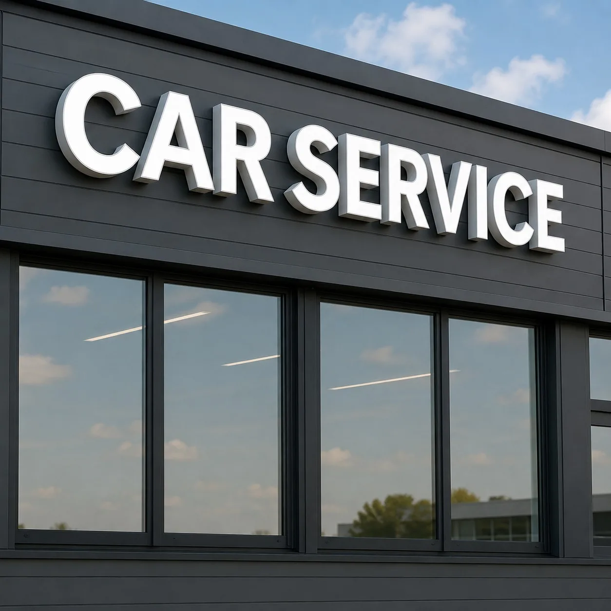
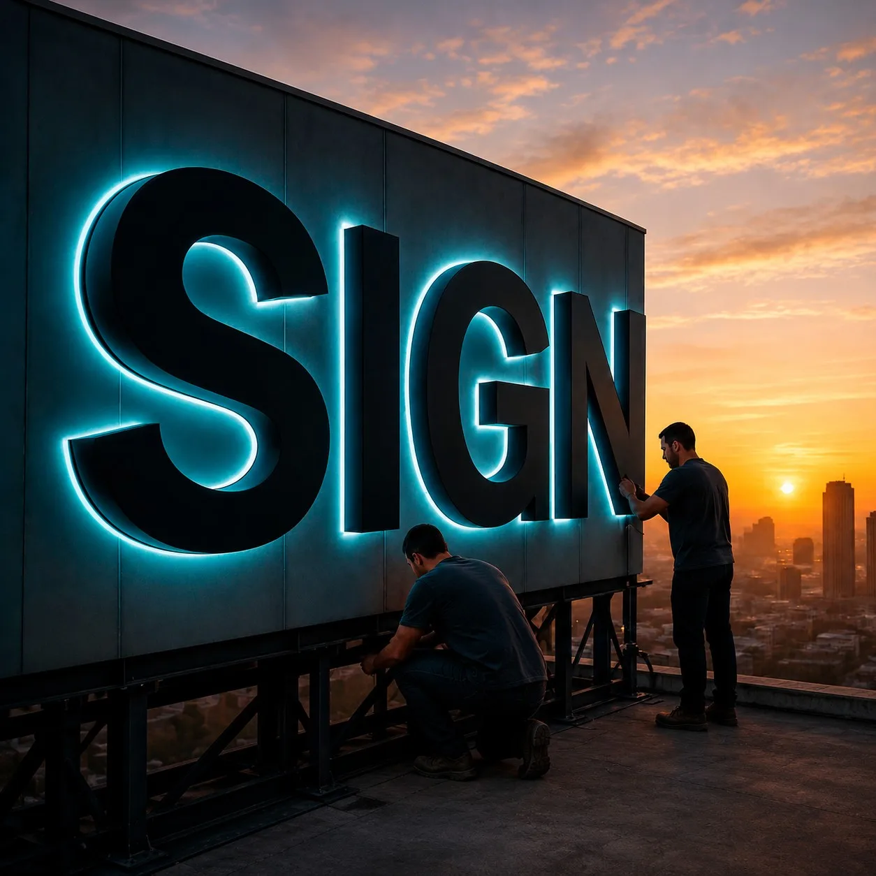
Illuminated letters and logos aren’t just signage. A single glowing initial mounted on a monument sign can turn into the spot where people agree to meet, or the backdrop for half the photos taken outside a building. Run a full name across a high-rise and the building itself starts to read as the brand. At Royal Foam Art Design, we’ve watched this happen on projects we didn’t expect it from: a client asks for one letter, and a few years later it’s the thing locals point to when they’re giving directions.
Part of why illuminated letters work is the mismatch between how tough they are and how much they make people feel. They’re built to sit through storms, freeze-thaw cycles, and years of sun without fading, yet the first reaction people have is usually just “oh, look at that.” Visibility alone doesn’t make a sign memorable—the letters that get photographed and talked about are the ones designed to be looked at, not just seen. We still get a kick out of that first night the lights come on.
Illuminated Letters: The Secret Weapon of Memorable Branding
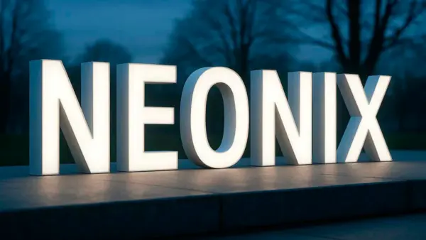
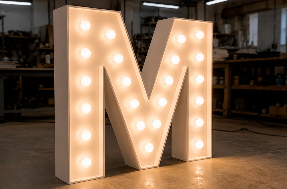
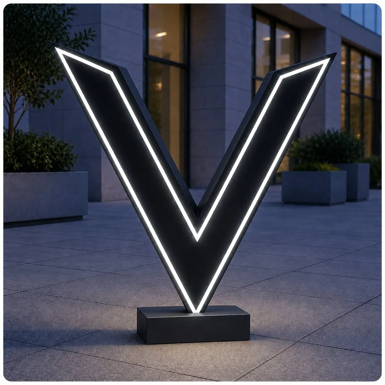
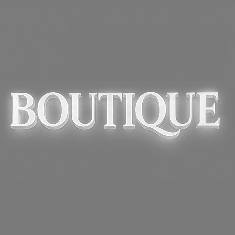
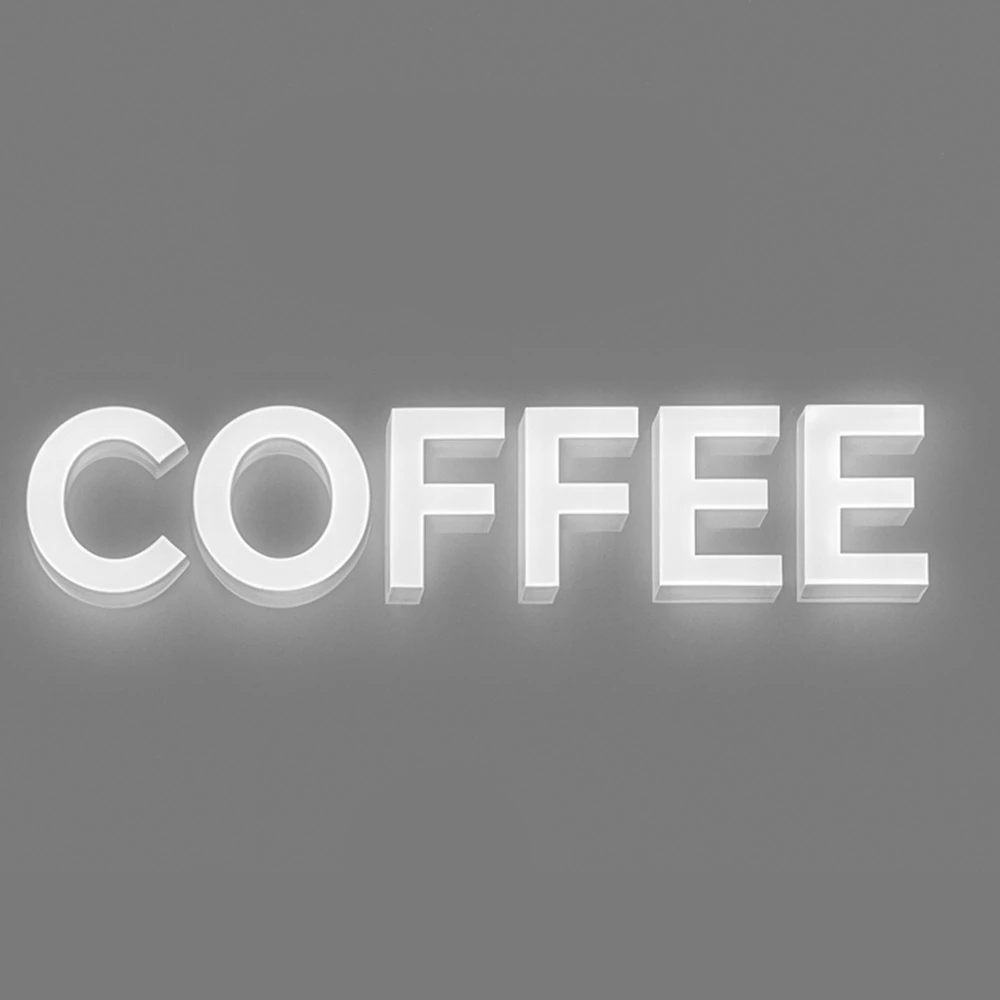
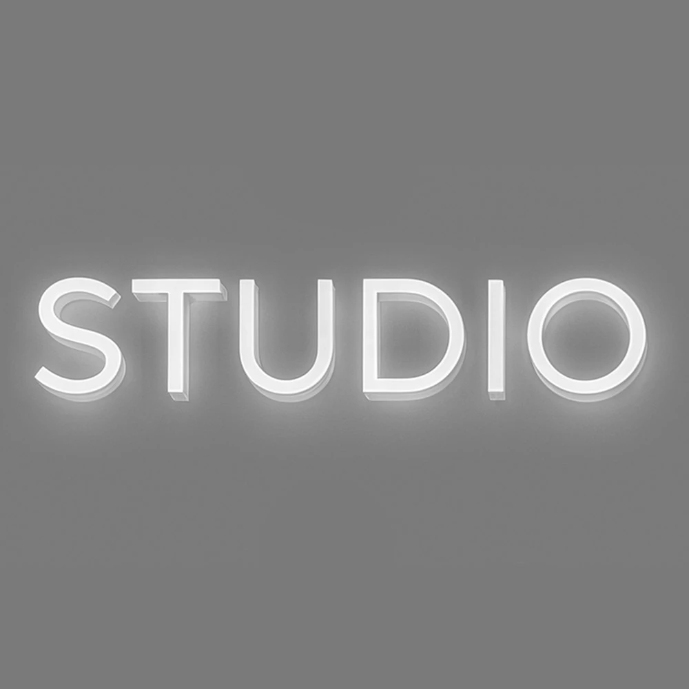
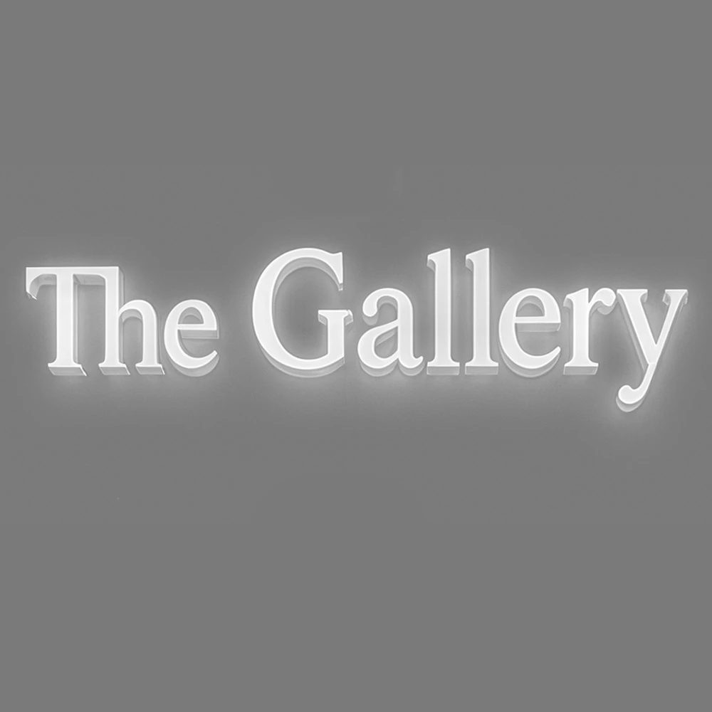
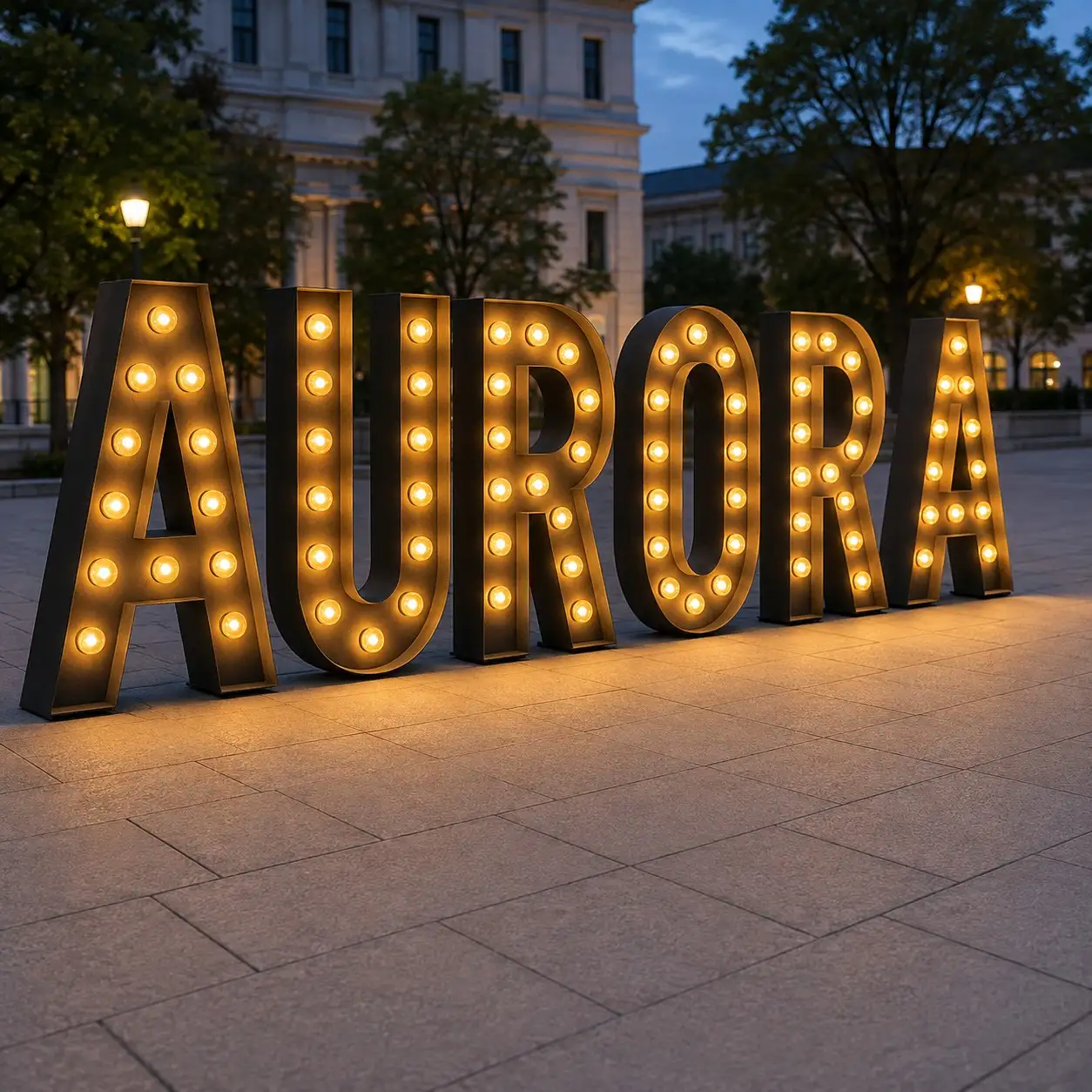
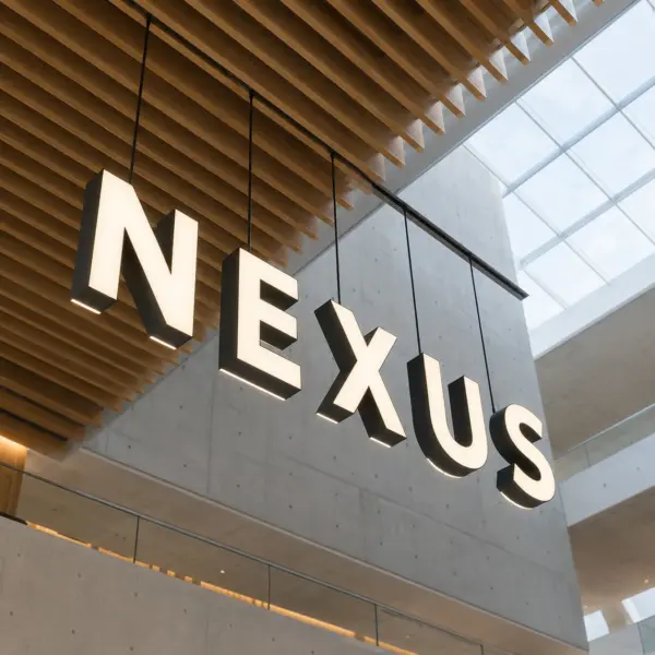
Why do illuminated letter signs work so well? Because they function on two levels. Practically, they provide visibility and orientation. A massive illuminated letter A can mark a campus entrance, while an illuminated letter M on a corporate tower becomes visible blocks away. Emotionally, they set the tone long before someone walks inside: “prestigious,” “welcoming,” “bold,” “modern”—whatever mood you want, we make it shine.
We’ve seen this in action. A hospital requested halo-lit letters with a soft glow—patients later described the building as “calm and reassuring.” A retail store used bright red acrylic fronts—shoppers felt drawn in by the energy of the light. These aren’t accidents. They’re deliberate design choices, based on how light influences perception. And honestly, when your brand identity lights up at night, it just hits different.
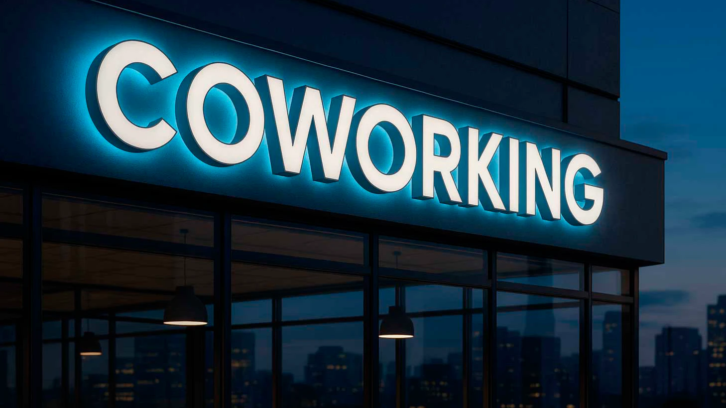
Flexibility is another reason illuminated letters are called the “secret weapon” of branding. Need bold front-lit acrylic for a shopping district? Done. Want subtle halo-lit elegance for a hotel? Absolutely. How about a combination of both for extra drama? No problem. Prefer a softer, evenly diffused glow instead of a hard edge? A flex face panel does that. They work 24/7, like your favorite all-night diner.
Illuminated Letters History: From Manuscripts to Skylines
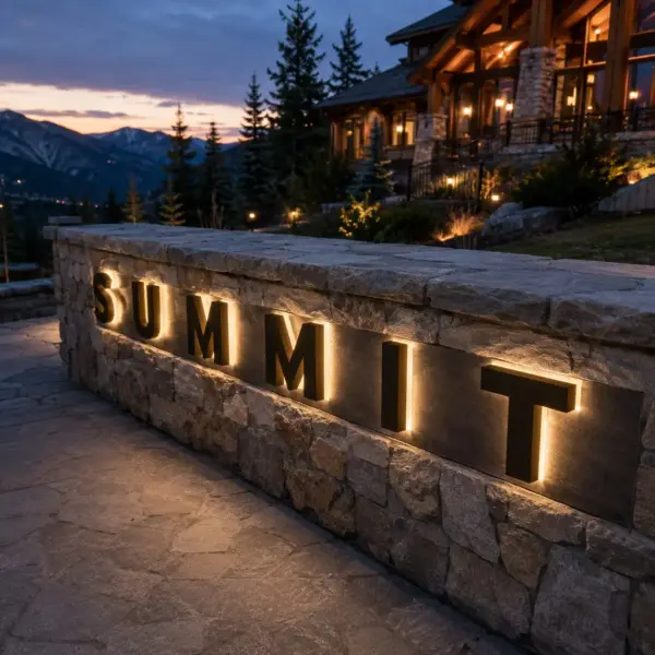
Illuminated letters didn’t start with electricity—the idea goes back centuries. Medieval scribes decorated initials with gold leaf, pigments, and ornament, long before anyone thought to wire a letter for light. An illuminated manuscript often opened with an ornate initial—like an illuminated letter J or illuminated letter L—that “signaled” to readers: this is important. Pages were often framed with elaborate borders, and the shapes of the letters were inspired by calligraphy, making words as much art as communication.
The leap from parchment to public space came in the 20th century. Neon lit up theaters, hotels, and diners—the illuminated letters C, T, R on marquees defined the look of that time period. Neon was gorgeous but fragile, energy-hungry, and high-maintenance. Then LEDs changed everything: safer, greener, more flexible. Now an illuminated letter M can glow in corporate blue one night and shift to rainbow colors the next for Pride Month. In a way, today’s illuminated letters carry forward the principles of illuminated manuscripts: striking calligraphy, dramatic borders, and bold design—but at the scale of entire buildings.
Illuminated Letters Design Process: From Sketch to Glow
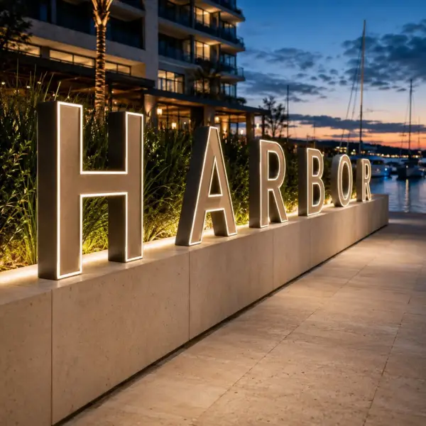
Our process always begins with conversation. Who is your audience? What should people feel as they approach the building—respect, energy, trust? We study the architecture, the environment, and the flow of traffic to understand how the letters will live day and night. Occasionally a client shows up with photos of old manuscript pages, and we end up borrowing the rhythm of that calligraphy for letterforms that read well both up close and from across a parking lot. We keep notes on every material, light level, and mounting decision as we go, mostly so nobody has to guess later why a choice was made.
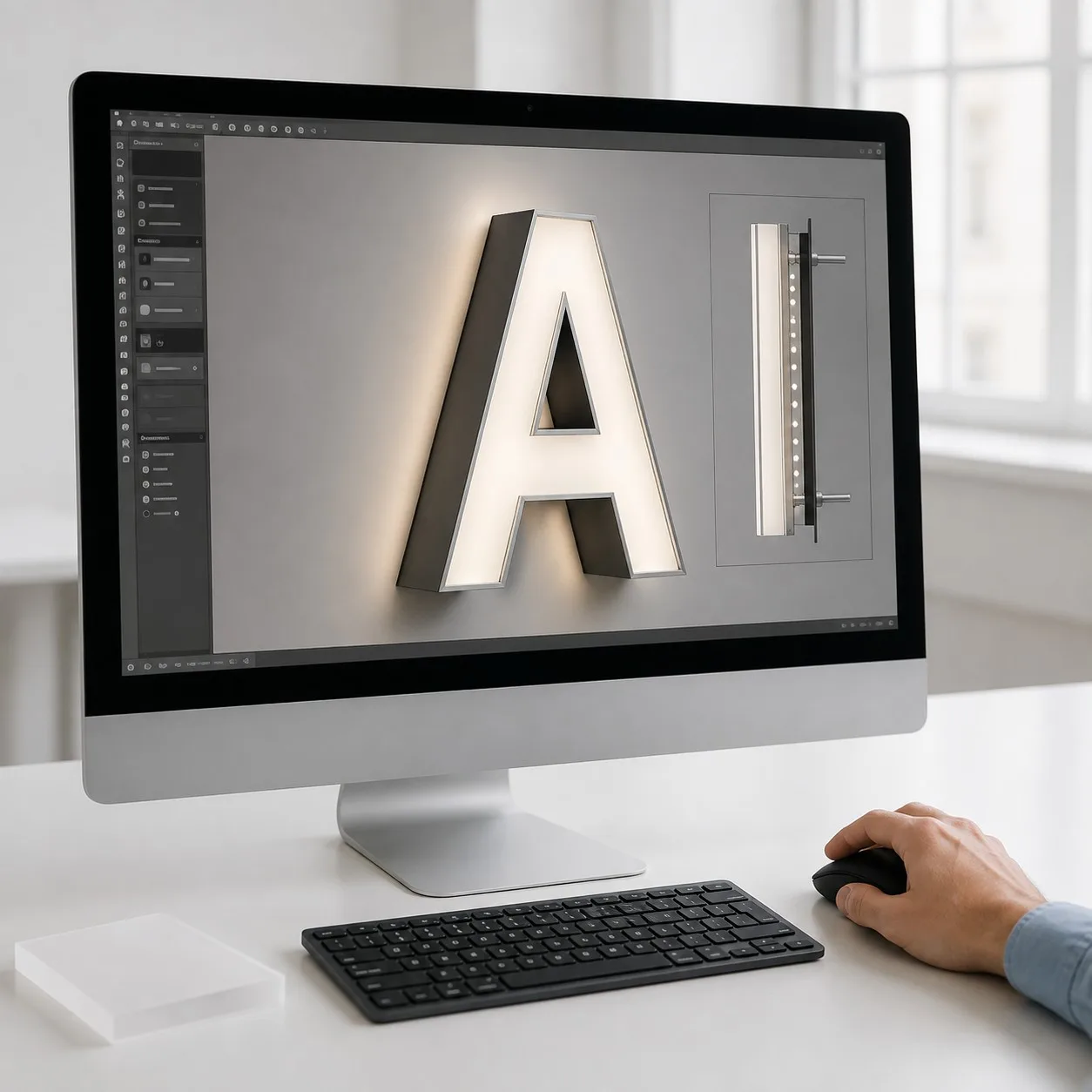
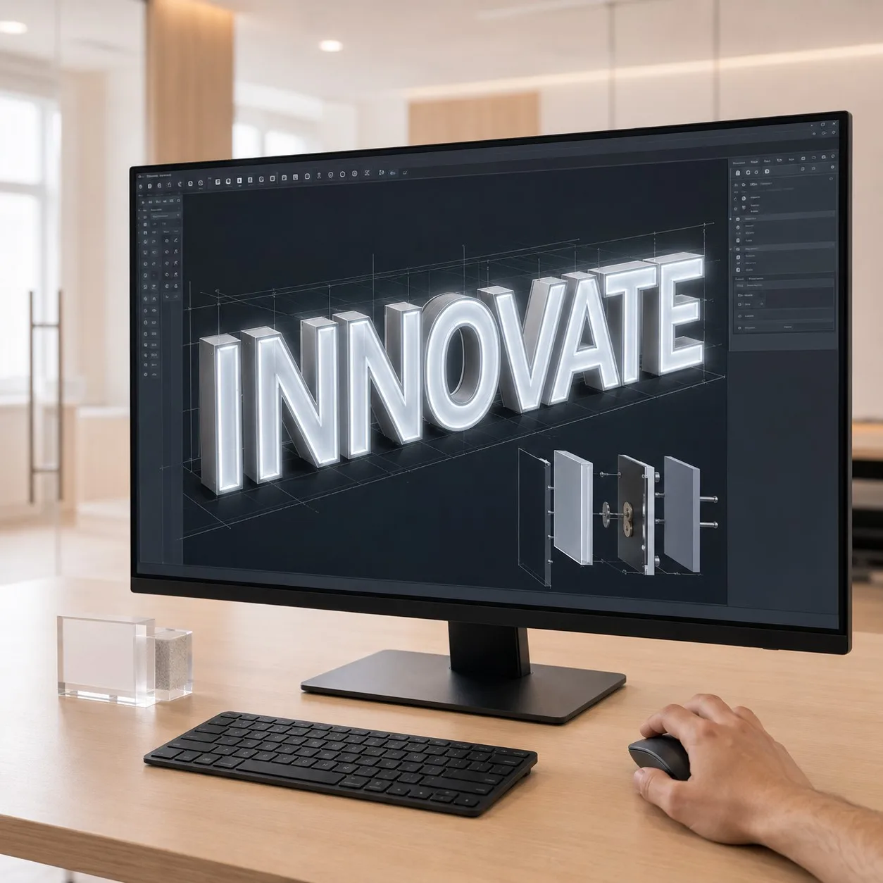
From there, we move to concepts and digital mockups. We compare how acrylic diffuses light, how aluminum reflects it, and how steel holds shape against the wind. We test prototypes, then comes the part everyone actually waits for—the night trial, when the sign goes live outdoors for the first time. Clients often say: “We knew it would look good, but not this good!” That’s when design turns into emotion. To get started, we’ll ask for your logo and brand fonts as vector files, along with the font name if you already have brand guidelines—that’s what lets us cut clean, accurate letterforms the first time.
From there, we move to concepts and digital mockups. We compare how acrylic diffuses light, how aluminum reflects it, and how steel holds shape against the wind. Prototypes are tested and then the best part, the nite trial. The first time the sign comes alive outdoors is unforgettable. Clients often say: “We knew it would look good, but not this good!” That’s when design turns into emotion. And that’s exactly why we go the extra mile—to make sure reality surpasses the renderings.
Illuminated Letters in Different Environments
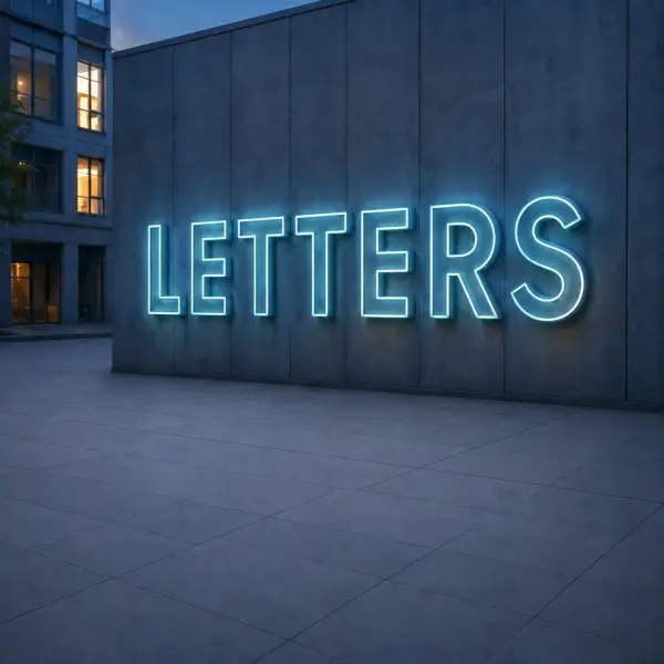
No two locations are the same, and illuminated letters perform differently depending on where they’re installed. A rooftop sign in Miami must endure salty air and hurricane winds: lightweight but rigid structures, corrosion-resistant materials, and wind load calculations. A monument sign in Texas has to be legible at 70 mph but not blind drivers: that means carefully tuned optics and dimming sensors. A Chicago high-rise must handle heavy snow and freeze-thaw cycles: drainage, sealing, and aluminum housings built to resist corrosion.
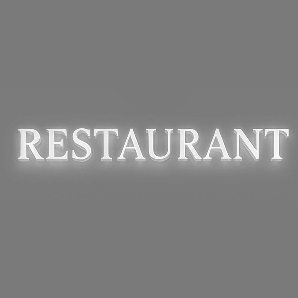
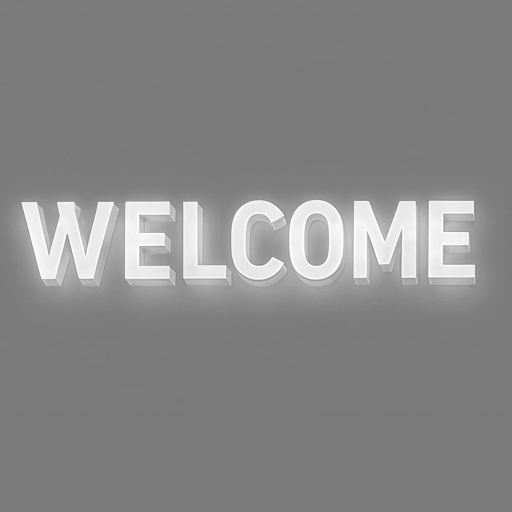
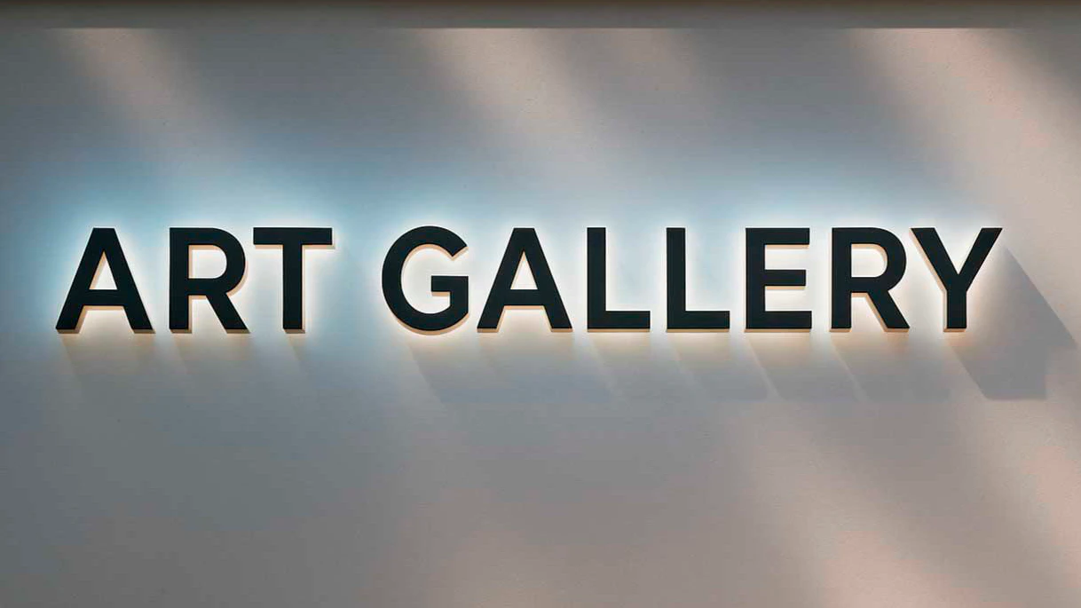
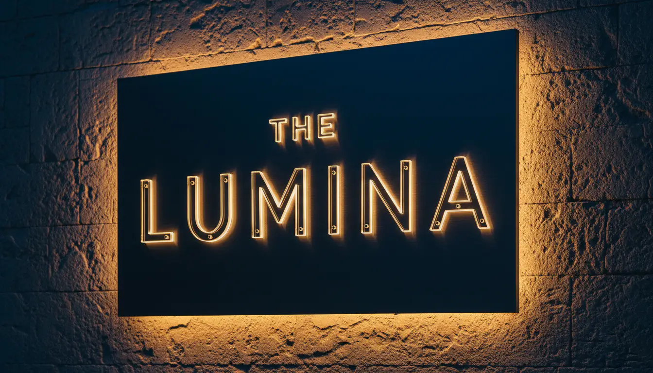
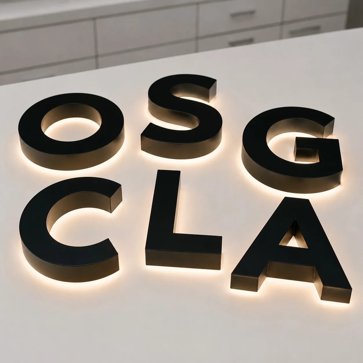
Context ends up deciding the design more than any style preference does. Halo-lit letters tend to work best for hotels, universities, and corporate lobbies, where the goal is prestige rather than a hard sell. Front-lit acrylic is king for retail strips and entertainment zones where grabbing attention in seconds is the goal. Combination lighting adds theatrical depth, especially on textured facades. For storefronts that need one look during the day and another after dark, day/night channel letters—translucent by day, glowing by night—give you both in a single sign. We never ask, “What’s best in general?” We ask, “What’s best here?”
Illuminated Letters and Brand Psychology
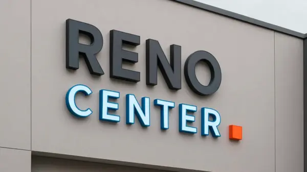
Light and material choices send messages long before words do. Polished metal in a halo-lit letter reads as exclusive, almost heritage-brand. Bright acrylic fronts do the opposite—they say come in, browse, stay a while. Aluminum frames with cool white LEDs land somewhere in between: precise, a little clinical, modern. We spend real time on the curves and spacing of each letter so it holds its shape in daylight and doesn’t blur into a glow blob at night.
On the healthcare project, the illuminated letter H alone was enough to soften the parking lot approach before anyone reached the door. In fashion retail, a halo-lit illuminated letter C in brushed metal gave the facade that couture-level presence. In each case, the psychology worked—customers and visitors felt something before they even engaged with the brand. When people say, “Meet me at the glowing letter,” you know the brand has won.
Illuminated Letters and Technology Evolution
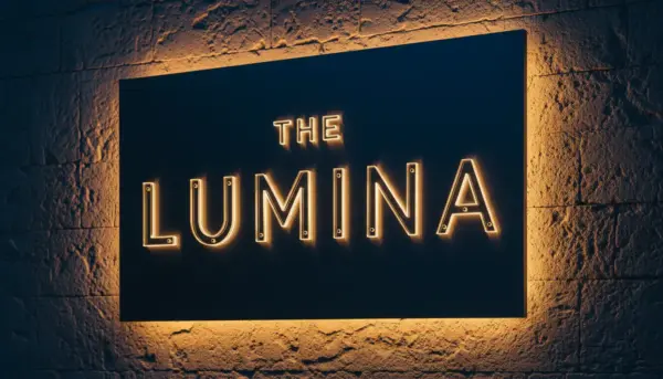
Neon gave city streets their magic glow, but LEDs revolutionized signage: less energy, more lifespan, infinite effects. Today’s systems can dim automatically, switch palettes for events, or enter “night mode” when neighborhoods quiet down. This isn’t just light—it’s smart light architecture.
One of our favorites? A Las Vegas venue with a giant illuminated letter S on an aluminum frame. Programmed RGB made it pulse red during rock shows, cool blue for conferences, rainbow for festivals. Pedestrians felt the vibe before they even bought tickets. That’s branding at its most powerful.
LEDs also happen to be the more sustainable choice—lower power draw, longer service life, and far less maintenance than the neon they replaced. Lower electric bills are a nice side effect of a decision most clients make for the look, not the savings.
Illuminated Letters Materials: Acrylic, Aluminum, and Metal Advantages
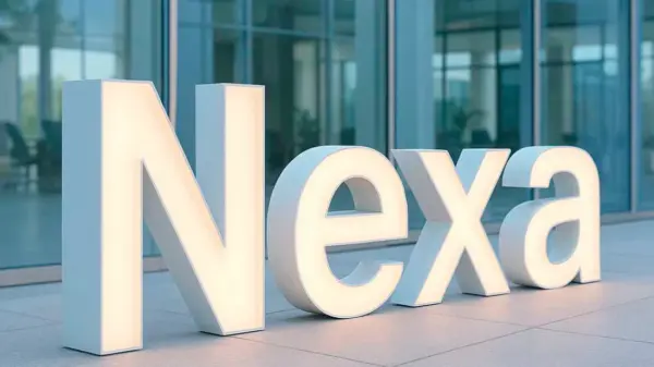
Acrylic gets chosen mainly for how evenly it diffuses light and how crisp the letter edges stay, not just brightness for its own sake. It’s lightweight, shapeable, and perfect for bold branded colors. A Chicago restaurant used acrylic to create playful illuminated letters J and G, getting that neon-style vibe without the fragility. Construction matters too: front-lit channel letters throw light straight off the face, while reverse channel letters (also known as backlit channel letters) push a soft halo glow onto the wall behind them—and a trim cap edge finishes either style with a clean, sealed line.
Aluminum is the workhorse. Light, corrosion-resistant, and structurally strong, it’s our go-to for large-scale or weather-exposed projects. A Midwest university used aluminum to build a 12-foot illuminated letter T—still standing proud after years of brutal winters.
Metal finishes like steel, brass, or bronze deliver prestige and presence. They’re heavier and pricier, but nothing screams sophistication like polished metal glowing against the night. For a Miami rooftop hotel, stainless steel halo-lit letters became “floating stars” in the skyline. And sometimes, when we design proportions, we borrow cues straight from calligraphy—because letterform elegance works just as well in manuscripts as on skyscrapers.
Illuminated Letters Projects: Real Cases That Show the Impact
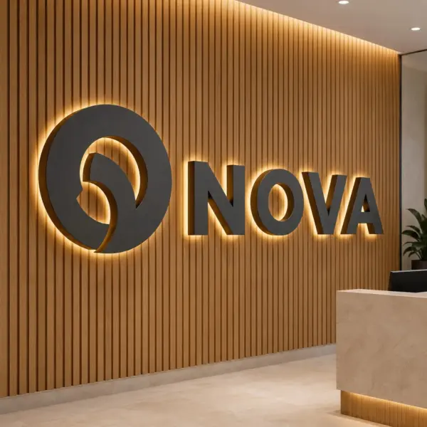
Corporate HQ Landmark (California)
Visitors kept missing the main entrance. A towering illuminated letter M in aluminum with crisp LEDs fixed the problem—and became a company icon. Employees now say: “Meet me at the M.”
Boutique Hotel Rooftop (Miami)
The skyline was already full of lights. Stainless steel halo-lit letters gave elegance without noise. Guests made it an Instagram hotspot, delivering daily organic marketing.
University Gateway (Midwest)
The campus needed an identity marker. A 12-foot illuminated letter T became the backdrop for graduation photos. It’s now a symbol of pride woven into student tradition.
Luxury Retail Flagship (New York)
The brand wanted signage as refined as its fashion. Illuminated letters C and L in brushed metal with halo glow did the trick. Shoppers describe the facade as “iconic.”
Healthcare Center (Dallas)
The goal: visibility without harshness. Acrylic-faced illuminated letters H and R with soft LEDs created a welcoming entrance. Patients called it “warm and inviting.”
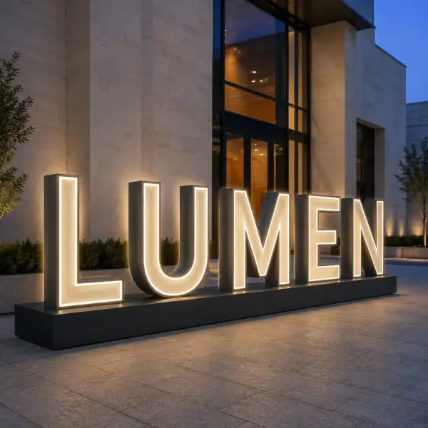
Entertainment Venue (Las Vegas)
The challenge: a venue that transformed nightly. A massive illuminated letter S with programmable RGB shifted to match every event. From rock shows to rainbow festivals, the sign became part of the performance.
City Arts Monument (West Coast)
The arts district wanted a symbol. A sculptural illuminated letter A blended steel and acrylic for beacon-like impact. Locals call it “the lighthouse” of the neighborhood.
Illuminated Letters Options: Affordable, Flexible, Reliable
We believe in options. Some clients just need cans and faces to integrate with existing systems. Others want fully built, tested, and balanced illuminated letters ready to install. We do both—and everything in between.
Our letters are built with UL recognized components, powered by GE Tetra LEDs, and backed by an unconditional lifetime guarantee. Affordability here doesn’t mean “cheap.” It means giving you the flexibility to choose what fits your brand and your budget—without ever compromising on quality. If nightly illumination matters less than staying on budget, our Acrylic Letters & Logos collection delivers the same custom shapes and brand fonts without LED lighting.
Why Order Illuminated Letters from Royal Foam Art Design
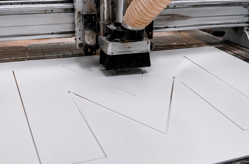
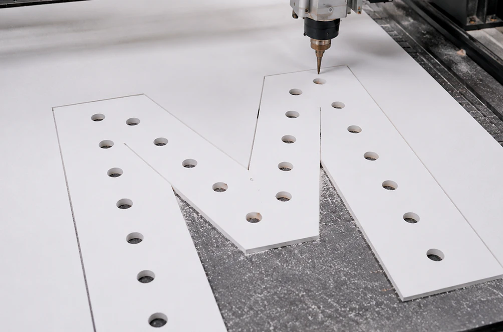
We don’t sell stock. We create custom. Illuminated letters and logos are one of our core sign programs, part of a broader custom fabrication and signage operation, so every order is designed, built, and finished in-house rather than farmed out piecemeal. Every project is tailored to the brand, the location, and the climate. Want bold acrylic in your signature shade? Done. Need aluminum tough enough for rooftop wind loads? Absolutely. Dreaming of brass or bronze prestige? We’ll build it to last and impress.
Every detail is configurable: fonts, sizes, depths, finishes, light effects, mounts—whether it’s letters, logos, or a combination of both. We consult, advise, and troubleshoot along the way. We’ve had clients come to us with nothing but a vague idea—and leave with a glowing symbol that ended up on postcards and travel blogs. That’s the work. And honestly? That’s the joy.