Sandblasted & V-Carved Signs: Lightweight HDU and Foam Dimensional Signage for Resorts, Clubs, Restaurants, and Private Estates
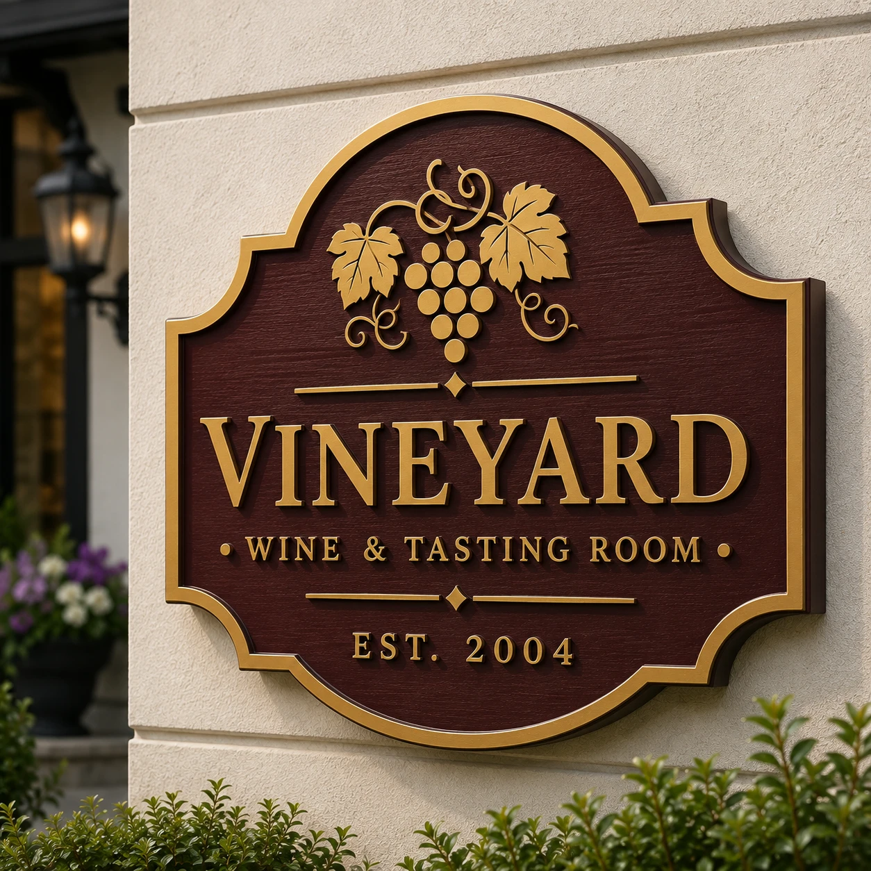
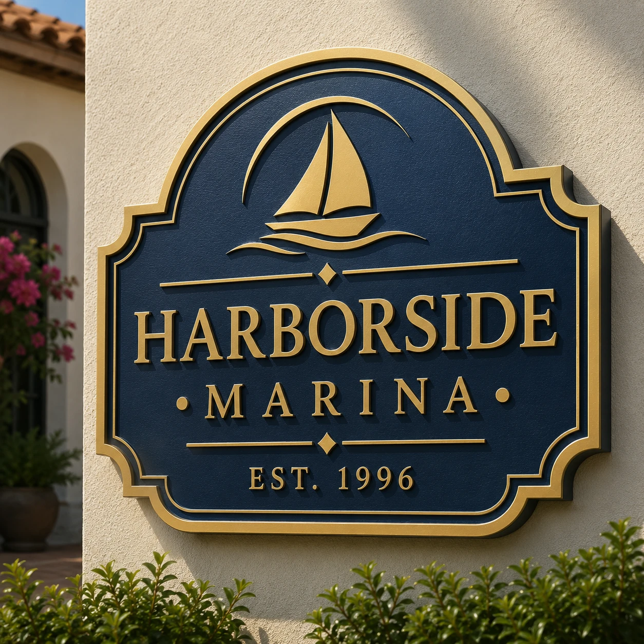
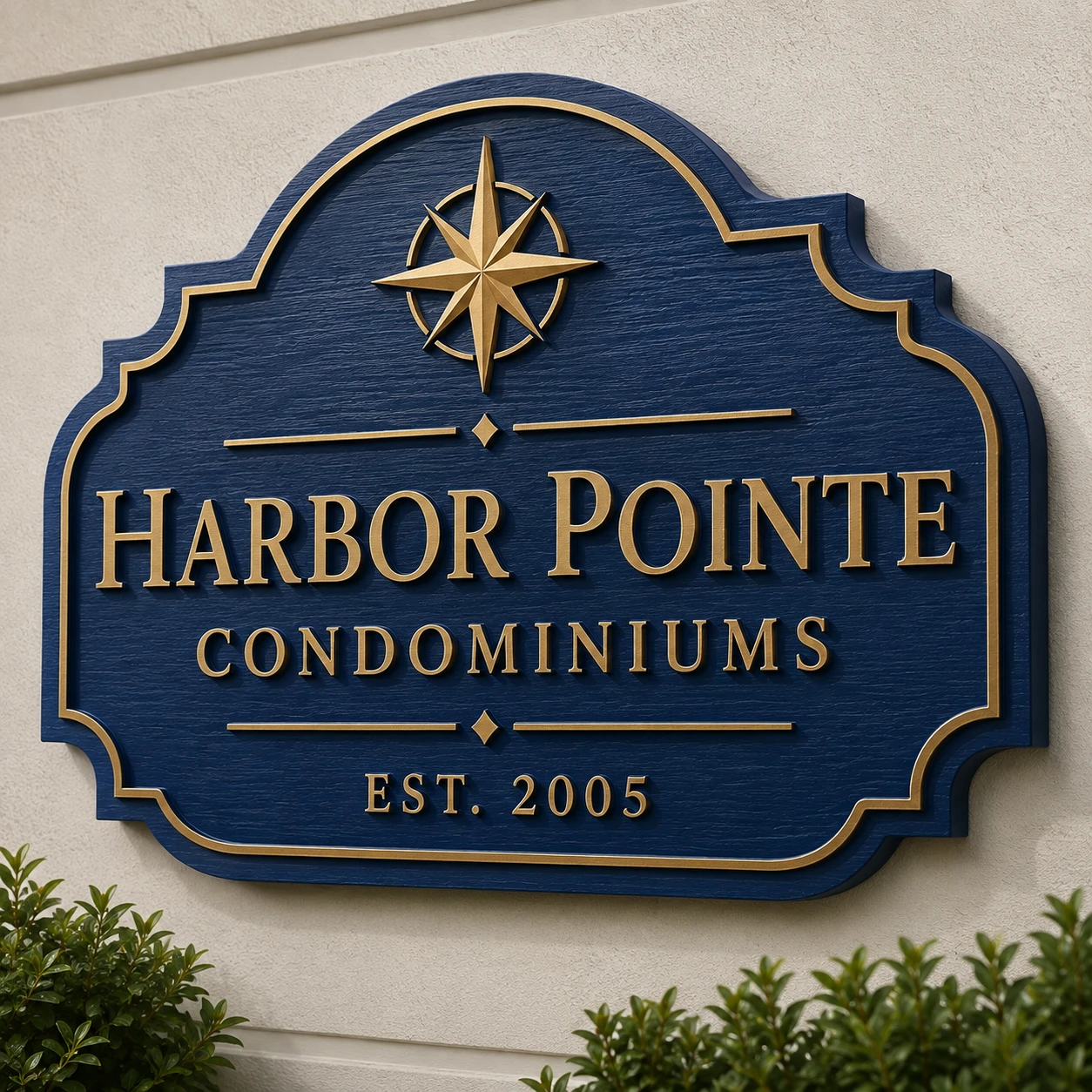
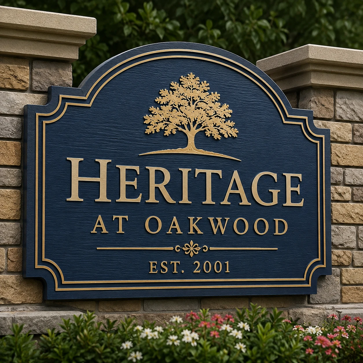
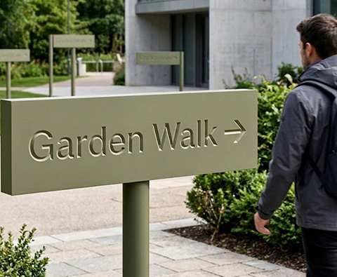
Sandblasted and V-carved signs are used when a brand needs more than a flat printed panel. These signs have physical depth, surface texture, carved lettering, raised borders, shadow, and a crafted architectural character. They are especially effective for restaurants, golf clubs, resorts, residential communities, private estates, parks, schools, churches, breweries, storefronts, and hospitality properties.
For Royal Foam Art Design, this category fits naturally into custom lightweight fabrication. Sandblasted-style and V-carved signs can be produced with HDU foam, EPS foam, CNC routing, carved textures, protective coatings, painted finishes, faux wood effects, faux stone finishes, dimensional letters, and outdoor-ready construction. The result can look like carved wood, stone, or traditional monument signage while remaining lighter, more customizable, and easier to fabricate than many traditional materials.
What Sandblasted & V-Carved Signs Are: Carved Wood-Look Signage Explained
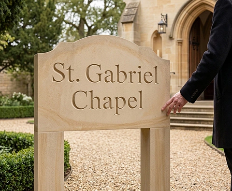
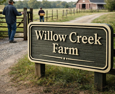
A sandblasted-style sign traditionally has a textured background with raised letters, logos, borders, or graphic elements. Historically, this look came from blasting cedar or redwood, removing softer grain and leaving a dimensional surface. Today, HDU foam is often used because it can be routed, carved, textured, primed, painted, and finished without the natural movement, splitting, warping, or rot risks of wood.
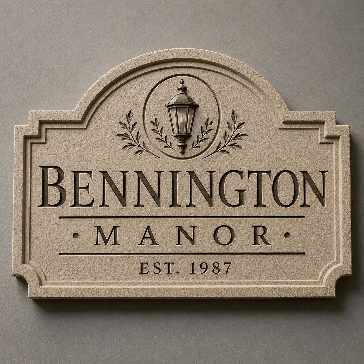
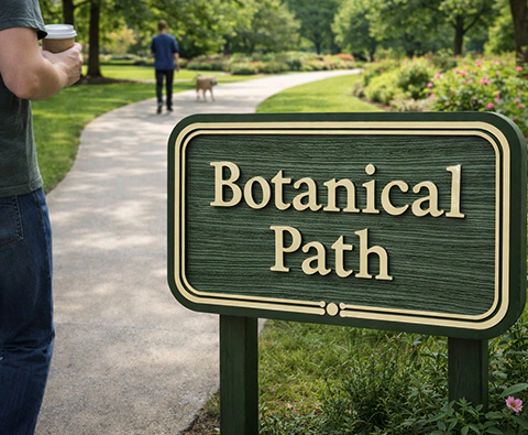
A V-carved sign uses a V-shaped router bit to cut beveled grooves into the sign face. This creates sharp shadows and a hand-carved appearance. V-carving is especially useful for serif fonts, script lettering, crests, address panels, plaques, borders, and decorative signs viewed from close or medium distance.
| Sign type | Visual effect | Best use |
|---|---|---|
| Sandblasted-style sign | raised letters over textured background | rustic, traditional, coastal, outdoor branding |
| V-carved sign | recessed beveled lettering | professional, classic, estate, plaque-style signage |
| Routed relief sign | raised/recessed dimensional layers | storefronts, monument faces, brand panels |
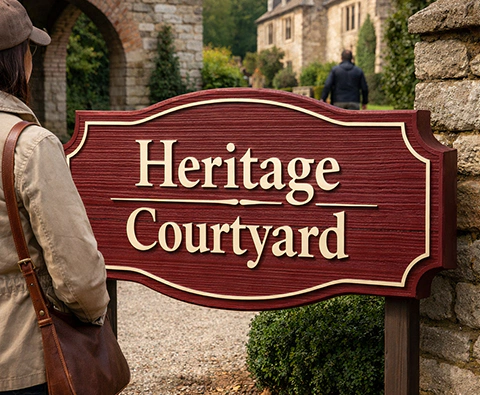
| Faux woodgrain sign | carved wood look without real wood | restaurants, lodges, communities |
| Faux stone carved sign | carved masonry appearance | resorts, estates, entrance monuments |
Many high-end signs combine these techniques: textured background, V-carved lines, raised letters, dimensional logos, painted details, gilded accents, and faux material finishes.
Why HDU and Foam-Based Systems Work Well for Carved Signs
Traditional carved wood signs have warmth and character, but wood can absorb moisture, crack, split, cup, warp, rot, or change with humidity. HDU is more stable for dimensional sign work and is widely used for routed, carved, and sandblasted-style signage.
EPS foam is valuable when the sign needs larger volume: thick borders, oversized frames, monument-style bodies, sculptural bases, or lightweight architectural surrounds. Because EPS is extremely light, it allows large signs to remain easier to ship, handle, and install. For large-format signage, Royal Foam Art Design can combine EPS for scale with HDU for crisp sign faces and details.
| Material | Role | Advantage |
|---|---|---|
| HDU foam | carved faces, V-carved lettering, crisp routed detail | stable, smooth, sign-grade precision |
| EPS foam | large sign bodies and monument-style volume | lightweight and efficient for scale |
| EPS + HDU hybrid | large sign with detailed face | balances cost, weight, and detail |
| Plywood / aluminum inserts | mounting, posts, brackets, cleats | stronger mechanical connection |
| Polyurea / polyurethane hard coat | exterior and high-contact protection | impact, abrasion, and moisture resistance |
| Scenic paint / faux finish | wood, stone, metal, aged effects | material realism and brand style |
The strongest construction is often a system: foam or HDU core, routed dimensional face, reinforced mounting zones, protective coating, exterior paint, and a finish selected for the brand style and environment.
Applications and Design Comparison
Applications: Sandblasted and V-Carved Signs for Clubs, Resorts, Restaurants, and Estates
Sandblasted and V-carved signs are most effective when the sign should feel established, crafted, traditional, local, premium, or architectural.
| Application | Typical design | Why it works |
|---|---|---|
| Golf clubs / country clubs | crest, carved name, raised border | classic and upscale |
| Restaurants / breweries | faux woodgrain, V-carved name, aged finish | handcrafted atmosphere |
| Resorts / hotels | carved monument face, stone or coastal finish | strong destination identity |
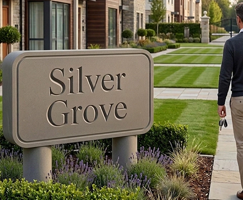
| Residential communities | textured entrance sign, raised lettering | neighborhood character |
| Private estates / homes | family name, address plaque, driveway marker | personal and permanent |
| Parks / nature centers | wood-look carved directional panels | outdoor-friendly style |
| Schools / churches | crest, carved lettering, monument face | institutional presence |
| Storefronts | dimensional brand sign | higher perceived value than flat graphics |
A private estate may need a refined V-carved address marker. A coastal resort may use a textured background with raised cream lettering. A restaurant may choose faux weathered wood with hand-highlighted letters. A golf club may combine a routed crest, dimensional border, and faux stone or carved-wood finish.
Sandblasted Texture vs V-Carved Detail
These two methods create different design effects.
Sandblasted-Style Signs: Texture and Raised Lettering
Sandblasted-style signs are about surface character. The textured background gives the sign a rustic, natural, or handcrafted feeling. Raised letters become more visible because they stand above the surface.
V-Carved Signs: Precision, Shadow, and Beveled Lettering
V-carved signs are about precision and shadow. The angled groove catches light and makes letters look cut by hand, even when produced with CNC accuracy.
| Feature | Sandblasted-style | V-carved |
|---|---|---|
| Main effect | textured background | crisp beveled cut |
| Best lettering | bold raised letters | serif, script, formal lettering |
| Viewing distance | medium to long | close to medium |
| Style | rustic, coastal, traditional | refined, formal, professional |
| Risk | background texture can reduce readability | thin strokes can fill with paint or weaken |
Premium projects often use both: texture for character and V-carving for detail.
Engineering, Fabrication, and Outdoor Protection
Sign Readability and Design Rules: Letter Size, Contrast, and Routing Depth
A carved sign can be beautiful and still fail if it is hard to read. The most important factors are letter size, contrast, routing depth, texture density, finish, and viewing distance.
For close-view signs such as estate plaques, interior panels, or small storefront signs, 2–6 inch letters may work. For driveway signs, restaurant façades, and property entrances, 6–12 inch letters are usually more practical. For road-facing signs or larger monument-style pieces, lettering may need 12–24 inches or more, depending on traffic speed, distance, contrast, and lighting.
| Design factor | Recommendation | Reason |
|---|---|---|
| Font | avoid overly thin strokes outdoors | improves durability and readability |
| Routing depth | match depth to viewing distance | shallow detail disappears at distance |
| Texture | keep texture secondary to lettering | background should not fight the message |
| Contrast | strong light/dark separation | improves visibility |
| Paint buildup | avoid filling carved grooves | preserves crisp V-cut detail |
| Border | scale border to sign size | gives structure and premium framing |
For V-carved signs, very thin serif strokes or delicate script must be planned carefully. For sandblasted-style signs, heavy texture behind small letters can reduce clarity. The sign must be designed for real-world viewing, not only for a rendering.
Fabrication Workflow: CNC Routing, V-Carving, and Finishing
A strong sandblasted or V-carved sign starts with clean artwork. Low-resolution logos, weak vectors, inconsistent spacing, and poor curves can create visible problems once the file becomes a routed object.
A typical fabrication process includes:
| Step | Purpose |
|---|---|
| Design review | confirms size, viewing distance, font, environment |
| Vector cleanup / CAD setup | prepares accurate routing paths |
| Material selection | chooses HDU, EPS, hybrid core, inserts, or applied letters |
| CNC routing / V-carving | cuts lettering, borders, relief, and grooves |
| Texture creation | creates sandblasted look, faux grain, or stone effect |
Recommended Articles
Outdoor LED Signs: Custom Illuminated Foam and HDU Signage for Storefronts, Hotels, Restaurants, and Monument Entrances
See the results
Molds for Cast Stone Signs: Master Patterns, Mold Fabrication, and Lightweight Stone-Look Monument Signage for Communities, Resorts, and Estates
See the results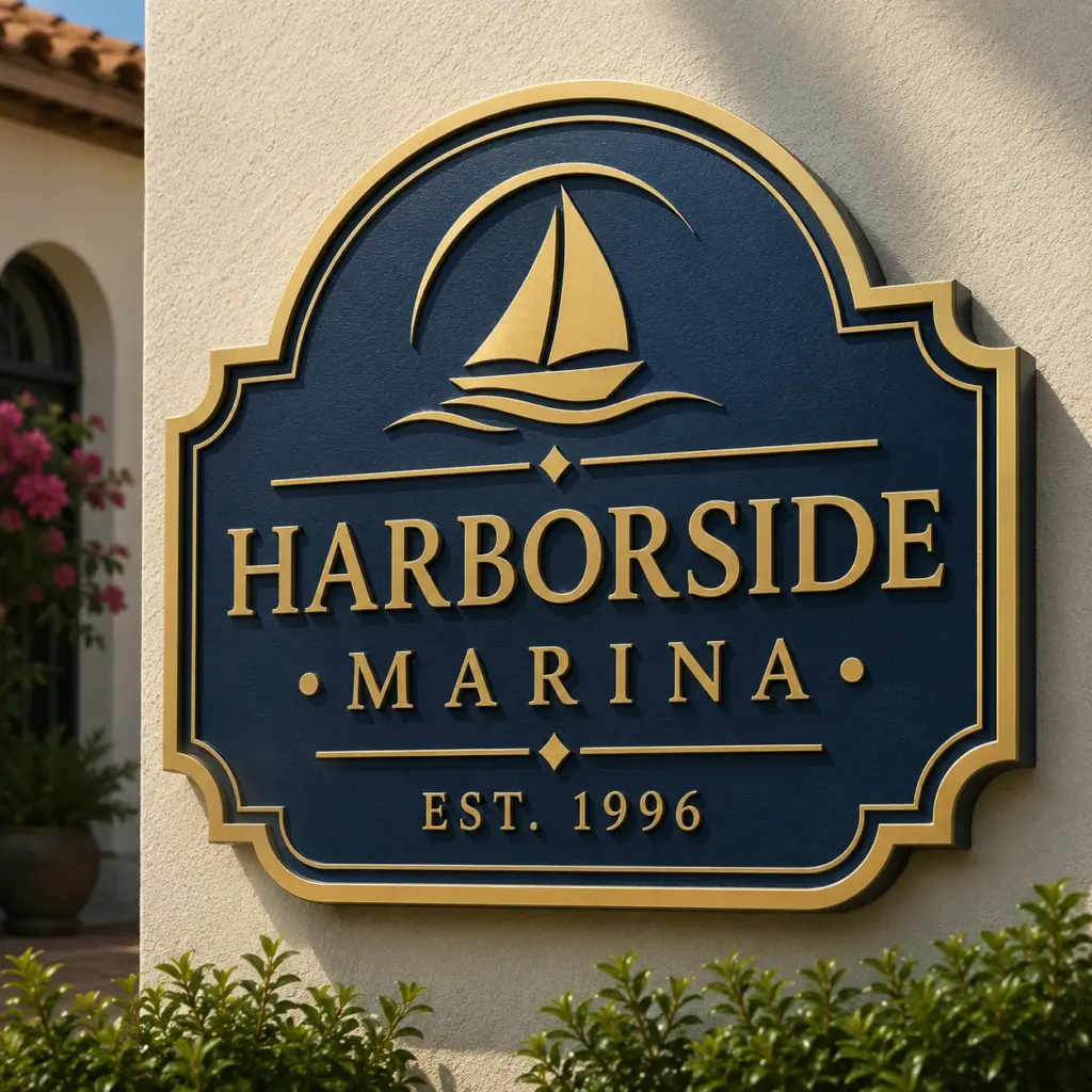
Sandblasted & V-Carved Signs: Lightweight HDU and Foam Dimensional Signage for Resorts, Clubs, Restaurants, and Private Estates
See the results
Industrial 3D Printing for Large-Scale Custom Fabrication: From Digital Model to Production-Ready Parts
See the results
Designs for Places of Worship: Lightweight Architectural Elements for Sacred, Community, and Prayer Spaces
See the results
Wedding Arch Colonnades: Technical Fabrication for Luxury Ceremony Entrances, Aisle Architecture, and Event Spatial Design
See the results
Architectural Shapes: Lightweight Custom Forms for Interiors, Exteriors, Homes, Buildings, and Branded Spaces
See the results
Foam Routed Signs: Precision-Cut Dimensional Signage for Lightweight, Custom, and Architectural Brand Environments
See the results
Foam Monument Signs: Lightweight Architectural Signage for Entrances, Campuses, Retail Plazas, and Brand Landmarks
See the results