Small Metal Letters: Precision Signage for Premium, Durable, and Architectural Brand Identity
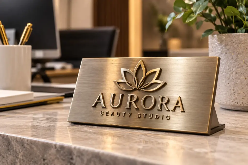
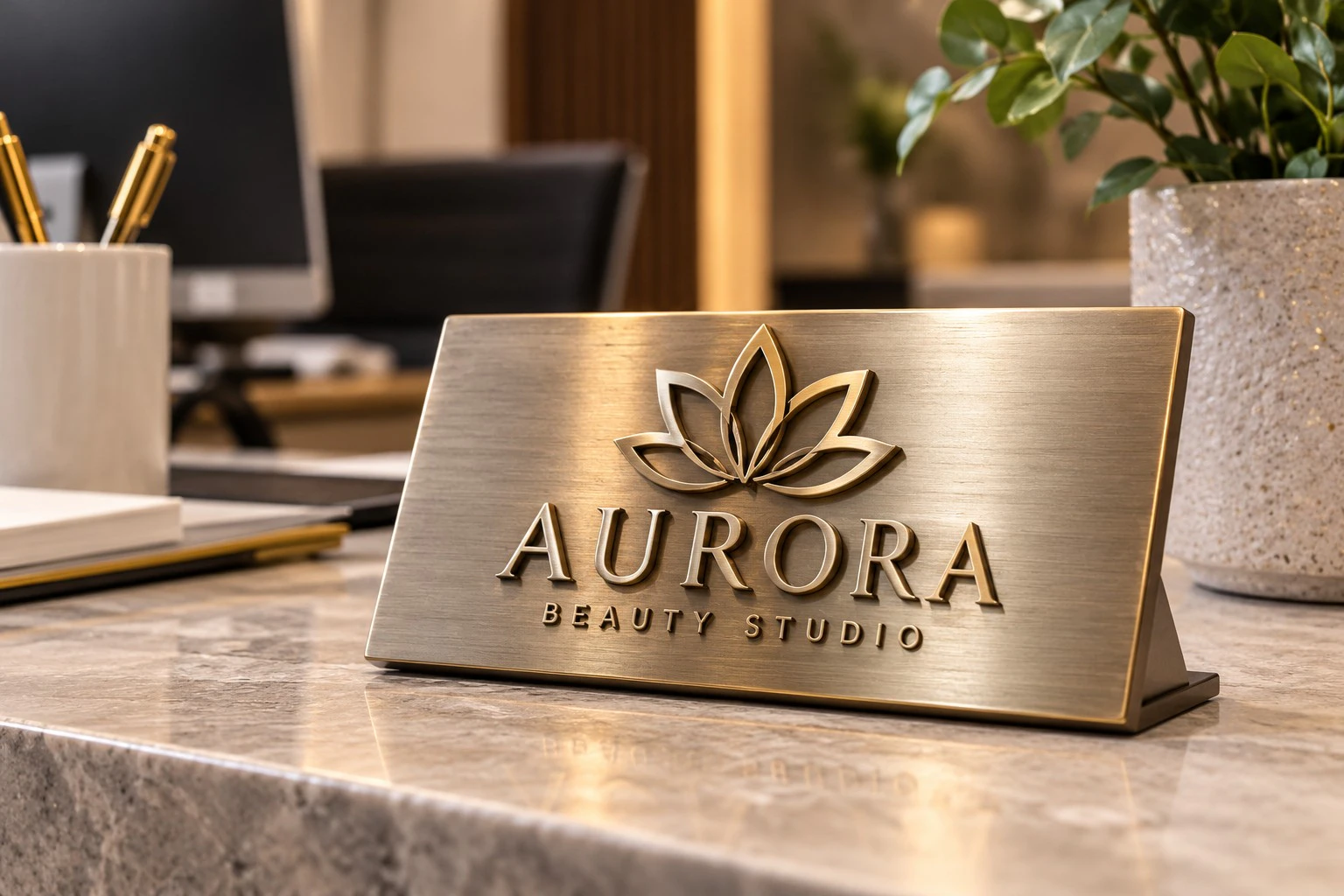
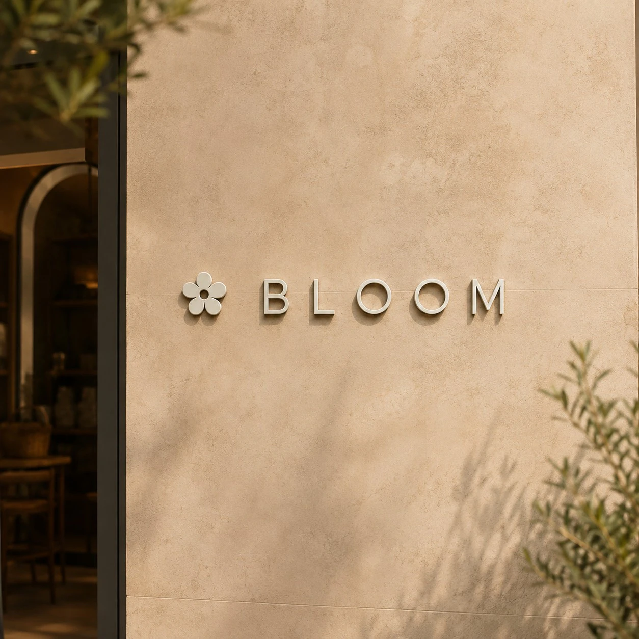
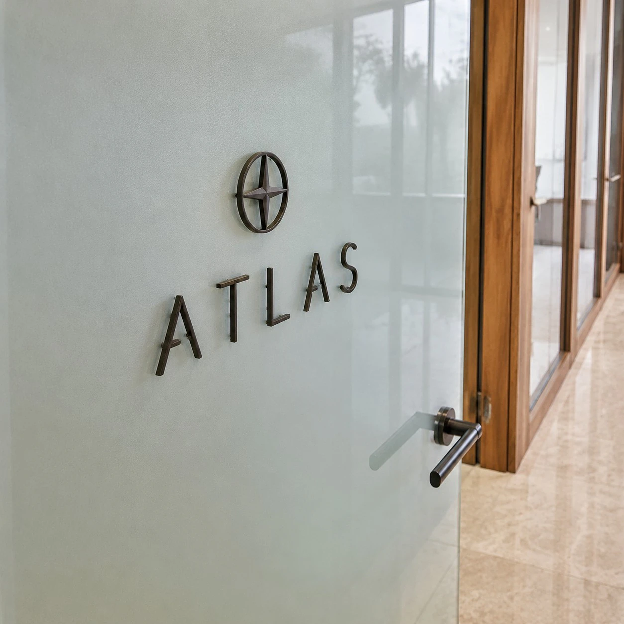
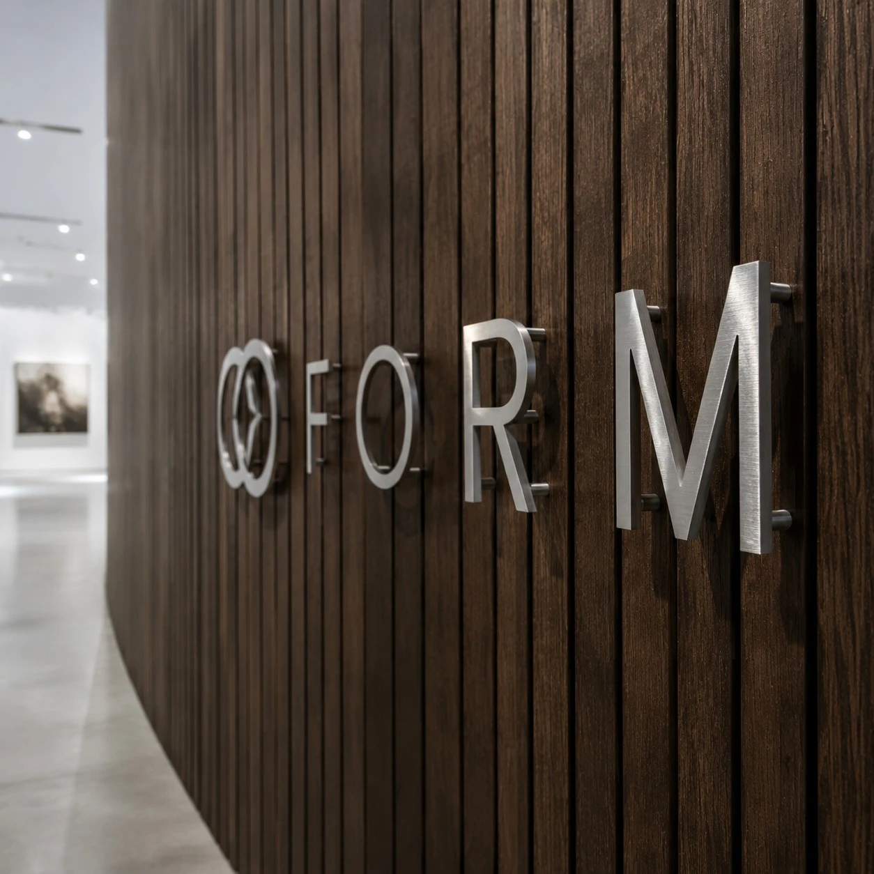
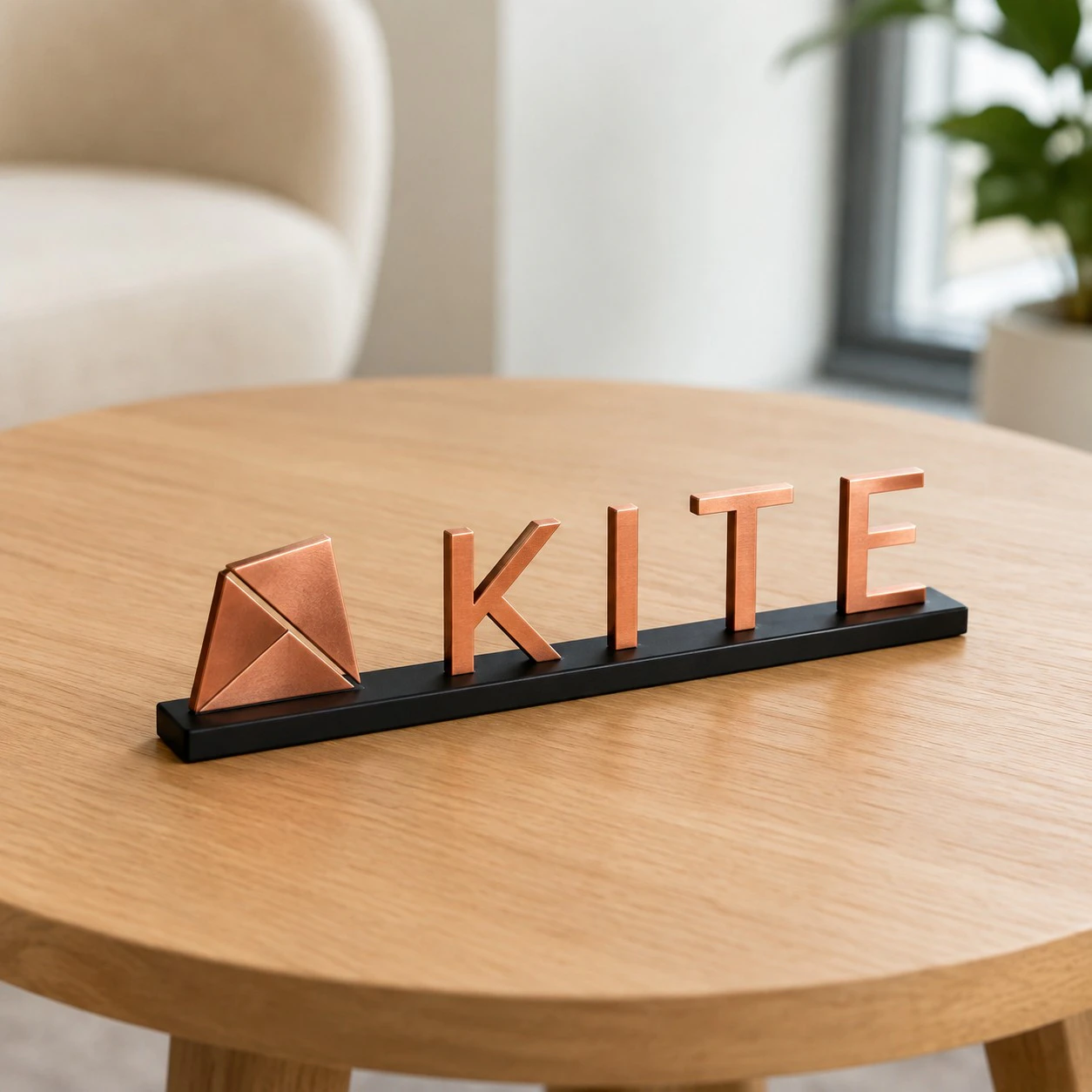
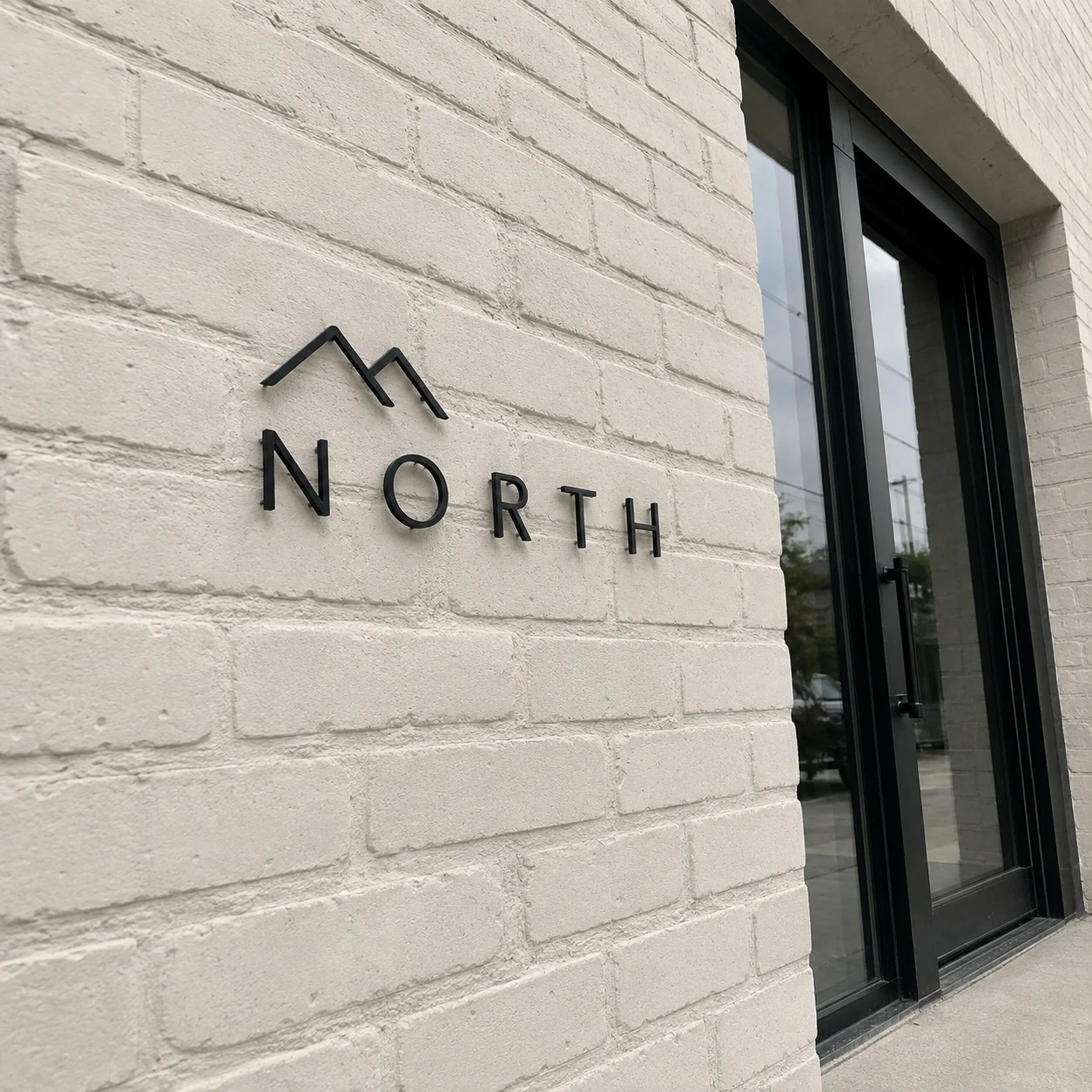
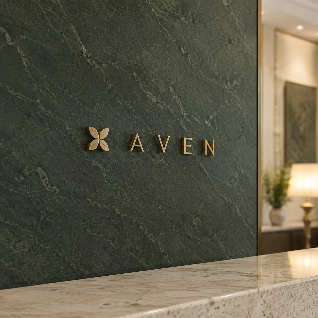
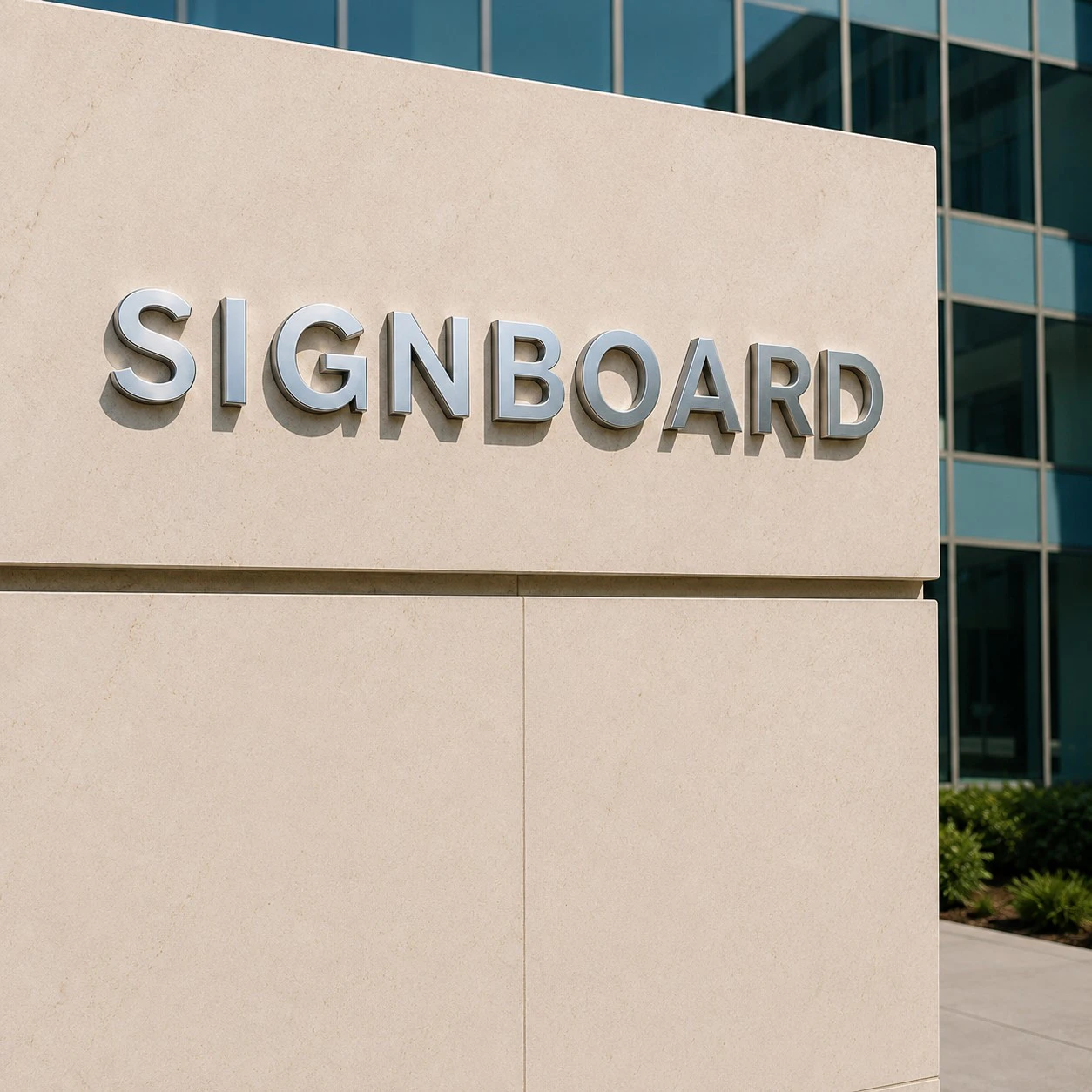
Small Metal Letters are one of the most refined categories of dimensional signage. They are not designed to overwhelm a space with scale. Their strength is precision, permanence, material depth, and a polished professional impression. For office lobbies, reception walls, boutique interiors, financial institutions, restaurants, hospitality spaces, monument signs, corporate suites, medical offices, galleries, and high-end retail environments, small metal letters communicate stability and authority in a way that plastic, foam, or printed graphics often cannot.
Royal Foam Art Design’s catalogue presents Small Metal Letters as premium signage designed for businesses that value precision, elegance, and prestige. The catalogue highlights brushed, polished, painted, and custom-cut metal finishes; CNC-machined or waterjet-cut production; mounting templates and hardware; flush mounting, standoff mounting, and backplate applications; repeatable accuracy for multi-location brands; custom thicknesses and face profiles; beveled and rounded edges; and integration with acrylic panels, foam backers, and lighting.
What Small Metal Letters Are Used For
Small metal letters are best when signage must feel permanent, precise, and premium. They are commonly used for reception logos, company names, office doors, conference rooms, donor walls, building directories, wayfinding signs, luxury retail displays, restaurant branding, hotel interiors, monument signs, and exterior entrance branding.
| Use case | Typical format | Practical value |
|---|---|---|
| Corporate reception | brushed metal logo and letters | premium first impression |
| Financial / legal office | polished or satin wall signage | authority, trust, permanence |
| Boutique / retail | metallic brand mark or product-zone sign | luxury material cue |
| Restaurant / hospitality | brass, bronze, blackened, or polished letters | atmosphere and identity |
| Monument / entrance sign | stud-mounted or backplate-mounted letters | long-term exterior visibility |
Small metal signage is not always about being loud. In many interiors, the most effective metal letters are restrained: thin enough to feel elegant, thick enough to cast a clean shadow, and finished well enough to look intentional from close viewing distance.
Materials and Metal Options
The most common metals for dimensional lettering include aluminum, stainless steel, brass, bronze, copper, and mild steel with protective coating. Aluminum is lightweight, machinable, corrosion-resistant, and cost-effective. Stainless steel is durable, clean, and excellent for modern corporate or healthcare environments. Brass and bronze create a warmer, more luxurious tone. Copper adds character but develops patina unless sealed. Mild steel can support an industrial look but requires stronger corrosion protection.
| Metal | Strengths | Best use |
|---|---|---|
| Aluminum | lightweight, machinable, corrosion-resistant | office signs, retail, exterior letters |
| Stainless steel | durable, modern, premium | corporate, medical, institutional signage |
| Brass | warm, luxury feel, classic appearance | hospitality, restaurants, boutiques |
| Bronze | prestigious, architectural, long-lasting | monument signs, high-end interiors |
| Copper | rich color, patina potential | boutique, heritage, custom design |
| Powder-coated steel | strong, graphic, industrial | modern interiors and exterior panels |
Material choice affects not only durability but also brand tone. Stainless steel feels modern and controlled. Brass feels warmer and more crafted. Blackened metal feels architectural and minimal. Polished chrome-like surfaces feel premium but show fingerprints and reflections more easily.
Size, Thickness, and Dimensional Effect
Small metal letters rely on proportion, spacing, and finish quality more than oversized scale. Typical letter heights may range from 2–6 in for door signs, room IDs, plaques, and close-view labels; 6–18 in for reception walls, office logos, boutique interiors, and restaurant identity walls; and 12–24 in or more for building entrances, monument signs, and exterior visibility from a distance.
Typical thicknesses may range from ⅛ in to ½ in for many interior applications, while heavier architectural or exterior letters may use ¾ in to 1 in or more depending on size, mounting, and desired depth. For small reception or office lettering, ¼ in to ⅜ in often creates enough shadow and material presence without feeling bulky.
| Thickness | Best use | Visual effect |
|---|---|---|
| ⅛ in | door signs, small labels, fine lettering | subtle and minimal |
| ¼ in | office logos, reception letters | clean dimensional presence |
| ⅜ in | premium wall signage | stronger shadow and depth |
| ½ in | larger interior letters or small exterior signs | more architectural weight |
| ¾–1 in+ | monument or high-impact applications | strong dimensional authority |
Letter height and viewing distance must be planned together. A 2–3 in office door letter is viewed close up and needs edge quality. A 6–12 in reception logo needs contrast, spacing, and shadow. A building entrance sign viewed from 20–50 ft may require larger letter heights, thicker strokes, and stronger contrast against the background.
Fabrication: CNC, Waterjet, Laser, and Edge Quality
Small metal letters are commonly CNC-machined, waterjet-cut, or laser-cut, depending on material, thickness, geometry, and finish. CNC machining is useful for controlled edges, bevels, countersinks, and dimensional details. Waterjet cutting handles thicker metal and complex shapes without heat distortion. Laser cutting is efficient for thinner sheets and sharp flat profiles.
A typical production workflow includes vector file cleanup, material selection, thickness selection, nesting, cutting, deburring, edge finishing, sanding or brushing, polishing or painting, protective coating, hardware preparation, mounting template production, packaging, and installation instructions.
| Production step | Technical purpose |
|---|---|
| Vector cleanup | protects logo geometry and letter spacing |
| CNC / waterjet / laser cutting | creates accurate repeatable shapes |
| Deburring | removes sharp edges and improves safety |
| Brushing / polishing | defines surface character and reflectivity |
| Protective coating | improves durability and reduces oxidation |
| Mounting template | protects alignment during installation |
Edge quality is critical. Small metal letters are often viewed up close, so burrs, uneven brushing, scratches, inconsistent polish, or exposed tool marks can immediately weaken the premium impression. Precision is not optional; it is the product.
Finishes, Colors, and Surface Treatments
Metal letters offer a wide finish range: brushed aluminum, polished stainless steel, satin stainless, mirror polish, anodized aluminum, brass, bronze, antique brass, blackened metal, powder-coated color, painted finish, clear-coated metal, patinated copper, and metallic PVD-style effects.
| Finish | Best use | Risk to manage |
|---|---|---|
| Brushed metal | offices, institutions, retail | directional grain consistency |
| Polished / mirror | luxury interiors and feature walls | fingerprints, glare, scratches |
| Satin metal | premium but restrained branding | surface uniformity |
| Powder-coated color | modern graphic signs | chipping at exposed edges |
| Brass / bronze | hospitality, boutique, heritage spaces | oxidation and patina control |
| Blackened metal | architectural interiors | uneven tone if poorly finished |
For brand consistency, color and metal tone should be checked under actual lighting. Warm lighting can make brass look richer but can also make stainless steel appear slightly yellow. Cool lighting can sharpen stainless steel but make warm metals feel less natural. In high-touch areas, clear coat or protective finish may be needed to reduce fingerprints, oxidation, and cleaning marks.
Indoor vs Outdoor Metal Letters
Indoor metal letters usually prioritize finish quality, alignment, lighting interaction, and clean wall integration. The biggest indoor risks are glare, fingerprints, adhesive failure, visible mounting errors, and poor contrast against the wall. For interiors, satin, brushed, blackened, or clear-coated finishes are often more practical than mirror polish because they hide fingerprints and cleaning marks better.
Outdoor metal letters require a stronger engineering approach. Rain, UV exposure, temperature changes, humidity, pollution, salt air, and freeze-thaw cycles can affect the metal, coating, anchors, and wall connection. Exterior installations should use corrosion-resistant metals or protective coatings, stainless or coated hardware, proper spacers, sealed penetrations, and isolation between dissimilar metals to reduce galvanic corrosion.
| Environment | Main priority | Recommended strategy |
|---|---|---|
| Indoor lobby | finish quality and alignment | templates, controlled lighting, satin/brushed finishes |
| High-touch interior | fingerprints and cleaning | clear coat, satin finish, cleaning protocol |
| Exterior entrance | corrosion and weather exposure | stainless/aluminum, sealed anchors, coated hardware |
| Monument sign | durability and visibility | thicker letters, stud mounting, contrast planning |
| Coastal / humid location | oxidation and galvanic corrosion | marine-grade hardware, isolation, protective finish |
Maintenance and Long-Term Performance
Metal signage is durable, but it is not maintenance-free. Brushed and satin finishes should be cleaned with non-abrasive cloths following the grain direction. Polished and mirror finishes need extra care because fingerprints, micro-scratches, and glare are more visible. Brass, bronze, and copper may oxidize or patina unless sealed; that can be desirable for some heritage designs but unacceptable for strict brand consistency.
For exterior signs, maintenance should include checking anchors, cleaning surface buildup, inspecting protective coatings, and watching for corrosion at fasteners or contact points. For multi-location brands, maintenance instructions should be standardized so each site preserves the same look over time.
Mounting, Installation, and Site Conditions
Metal letters can be installed flush-mounted, stud-mounted, standoff-mounted, backplate-mounted, rail-mounted, or integrated into acrylic panels, foam backers, stone, wood, glass, or architectural wall systems. The catalogue notes that installation can include mounting templates and hardware kits, with mounting customized depending on surface type and location.
| Mounting method | Best use | Practical advantage |
|---|---|---|
| Flush mount | clean interior walls | minimal projection |
| Stud mount | heavier letters and exterior signs | stronger mechanical hold |
| Standoff mount | premium dimensional effect | controlled shadow and depth |
| Backplate mount | uneven or delicate surfaces | easier alignment and serviceability |
| Rail mount | grouped letters or exterior conditions | structural consistency |
Wall substrate is a major planning factor. Drywall, plywood backing, glass, stone, tile, concrete, brick, ACM panels, and wood veneer all require different anchoring strategies. Adhesive may work for very small interior letters, but heavier metal letters usually require mechanical mounting. For exterior installations, corrosion-resistant studs, anchors, spacers, and isolation between dissimilar metals may be necessary.
Comparison With PVC, Acrylic, Foam, and Printed Graphics
Small Metal Letters should be chosen when the project needs material authenticity, durability, and prestige. PVC is lighter and more economical, but it does not carry the same premium material identity. Acrylic is polished and modern, especially with lighting, but it can scratch or crack under stress. Foam is excellent for large-scale sculptural signage, but small metal letters outperform it in close-view precision and permanence. Printed graphics are fast and low-cost, but flat and less architectural.
| Material | Strengths | Limitations | Best use |
|---|---|---|---|
| Metal | durable, premium, precise, long-lasting | higher cost, heavier, needs proper mounting | offices, exteriors, luxury branding |
| PVC | lightweight, affordable, paintable | less prestigious, less durable outdoors | indoor rollouts and simple signs |
| Acrylic | polished, glass-like, lighting-compatible | scratches, cracks, higher maintenance | premium interiors and lit logos |
| Foam | large volume, lightweight, sculptural | needs coating, less refined for small letters | oversized event and scenic branding |
| Printed vinyl | fast, cheap, replaceable | flat, lower perceived value | temporary promotions and graphics |
Metal is not always the fastest or cheapest option, but it is often the strongest choice when signage must feel permanent and serious. In brand environments where trust, luxury, stability, or architectural quality matter, metal letters justify their higher fabrication and installation demands.
Buyer Logic and Risk Control
The economic buyer wants long service life and a premium result that does not need frequent replacement. The brand manager wants accurate proportions, consistent finish, and repeatable quality. The designer wants the material to support the interior or façade language. The installer wants templates, correct hardware, and predictable anchoring. The facility manager wants durability, cleanability, and manageable maintenance.
Common mistakes include selecting metal that is too reflective for the lighting environment, using letters too thin for the viewing distance, ignoring fingerprints on polished finishes, installing heavy letters without proper anchors, mixing dissimilar metals without isolation, skipping protective coating, failing to align multi-letter layouts precisely, and choosing an indoor finish for an outdoor environment.
Expert Takeaway
Small Metal Letters are most effective when they are treated as precision architectural signage, not simple cut-out letters. Their value comes from real material, clean fabrication, correct thickness, controlled finish, safe mounting, maintenance planning, and careful alignment. They are ideal when a brand wants to communicate confidence, permanence, and polish without relying on oversized scale.
When properly engineered, small metal letters add depth, texture, and prestige to a space. They do not just display a name; they make the brand feel established, durable, and professionally built.
Recommended Articles
Outdoor LED Signs: Custom Illuminated Foam and HDU Signage for Storefronts, Hotels, Restaurants, and Monument Entrances
See the results
Molds for Cast Stone Signs: Master Patterns, Mold Fabrication, and Lightweight Stone-Look Monument Signage for Communities, Resorts, and Estates
See the results
Sandblasted & V-Carved Signs: Lightweight HDU and Foam Dimensional Signage for Resorts, Clubs, Restaurants, and Private Estates
See the results
Industrial 3D Printing for Large-Scale Custom Fabrication: From Digital Model to Production-Ready Parts
See the results
Designs for Places of Worship: Lightweight Architectural Elements for Sacred, Community, and Prayer Spaces
See the results
Wedding Arch Colonnades: Technical Fabrication for Luxury Ceremony Entrances, Aisle Architecture, and Event Spatial Design
See the results
Architectural Shapes: Lightweight Custom Forms for Interiors, Exteriors, Homes, Buildings, and Branded Spaces
See the results
Foam Routed Signs: Precision-Cut Dimensional Signage for Lightweight, Custom, and Architectural Brand Environments
See the results
Foam Monument Signs: Lightweight Architectural Signage for Entrances, Campuses, Retail Plazas, and Brand Landmarks
See the results